Wednesday, October 22, 2008

More lies from Diebold and the Johnson County Election Office

I did the whole early in-person voting thing just a few minutes ago. Busier than I would have thought. For a Wednesday. At 2 pm. Weeks before the election. In a torrential rainstorm. But it was indeed busier than peak hours at a typical Organization was... okay. Better than sometimes. Still sub-optimal. Since every 20 seconds someone asks for the date, you'd think they could write it down. No arrows so the flow is not clear. My favorite is that there are about enough workers to give you all the bits, but they insist on having someone walk with you to the machine, and talk you thru using it. Yet this is ONE guy, and he's painfully slow. So you wait around at the last table while a worker holds up the smartcard and a piece of paper, waiting for him. If you follow the saga of terrible e-voting machines, you'll have heard of the thing where Diebold/Premier (they still say "Diebold" on the machines here) machines have a stupid timeout "feature." It's all over, but Johnson County (where I live) got the press for it. Before I continue, I should mention I do interactive design. I've even specified/designed some kiosk systems. I have some knowledge of this, and the timeout here is insanely lame. I even try to get rid of them in kiosks in manned stores; the employees can go over and reset it if a user walks away. But in a voting... center... (what do you call this place?) it's filled with workers, and people demanding to vote. And who just walks away from a voting machine? Timeout is totally uncalled for. So, apparently they couldn't fix it, and best yet I get handed this on the way in: 
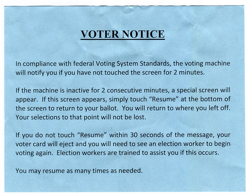
For the spiders and posterity, I'll transcribe it:
VOTER NOTICE In compliance with federal Voting System Standards, the voting machine will notify you if you have not touched the screen for 2 minutes. If the machine appears inactive for 2 consecutive minutes, a special screen will appear. If this screen appears, simply touch "Resume" at the bottom of the screen to return to your ballot. You will return to where you left off. Your selections to that point will not be lost. If you do not touch "Resume" within 30 seconds of the message, your voter card will eject and you will need to see an election worker to begin voting again. Election workers are trained to assist you if this occurs.
Okay, so I thought again, how stupid is this?
  • Timeout is unnecessary
  • It would be easily reached; both the long ballot initiatives are on the same screen, not to mention 20 judges at a time - Low vision users and the elderly can take minutes to read this sort of stuff
  • It's electronic; how many of those using it (especially those low-vision elderly ones) don't know how to react to a timeout diaglogue?
  • This little piece of paper is of no use at all. Dense text, no graphics, no actions quickly outlined. Better, not only is there no warning on the machine (I mean, taped to it, since they cannot fix the software) I had to finagle this out of the voting center; they wanted to take it back to use again, immediately after I read it.
  • I cannot believe this is a legal or regulatory requirement, which it says right there. I've always heard it can't be changed in time, etc. but now they are covering their asses by lying about why it's there. Nice.
I wanted to just stand there and wait for the timeout screen, but I was hungry, and it was clear I couldn't get a photo anyway. I wanted to do this because the non-modal info boxes were useless and invisible. A bar appeared at the top of the confirm-your-selections screen to I guess help you understand what to do next; but it was small, green on a blue background, and nowhere near where I am looking. I suspect the timeout message is similarly terrible, so would be easy to miss.

Saturday, October 11, 2008

An Ecosystem of Beeps

Motorola Sabre and spare battery - I prefer Icom, though
This past weekend I was out in the woods – as I often do – laden with assorted equipment, including a lot of navigation and communications electronics. At one point, a series of beeps started up.

The constant bip, bip, bip... one I was able to isolate pretty fast, but another took me fully 10 minutes. Every two minutes: Bo-up! Is it the headset? Not sure. Is it something I am hearing through the headset, like the GPS? Doesn't seem to be. Is it this radio? Mm... no. Is it the other radio? Yes! It's a low battery warning.


My phone also spends a fair amount of time beeping in a seemingly random manner. Some seem to have simply have no on-screen notifier. Sometimes this notice is hidden, as when in a browser, and even worse the timer for the notification expires even though it is not visible; by the time I get to the idle screen, there's nothing to see. Sometimes the phone is in another room, and I can't tell if a beep is from the phone, an alarm, the microwave, the stove, a computer, etc. etc.

A few tones are pretty unique and designed to elicit the right emotional response; sad and dying means Alison's phone battery is indeed sad and dying. Pop it on the charger. But far too many are essentially arbitrarily different tones, and very similar to other, unrelated tones.

Increasing use of multi-tasking mobile devices, and always-on applications – like a lot of the contextual ideas we come up with around here – will add to this confusion if the current trends continue. So, when you next design or specify alerting tones, put some extra thought into it; consider not just the application, but the entire device, and the whole electronic ecosystem in which your user operates.