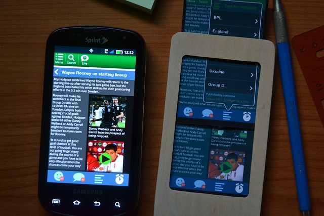
Your designs, on a real screen
Simple, simple, simple. Especially as a checkpoint, when working with others, confirming a partially-done design, or checking out changes to a design. You take a digital drawing file, and send it to the handset. There are a few steps and things to make sure it goes well, so I'll just list them out:- Any design can do. In any program. At any fidelity. Doesn't matter.
- It does need to be at the device aspect ratio. This also means you need to export for each type of device (iOS and Android have different aspect ratios). But you were already designing differently, right?
- Note that you can do this with dumbphones and featurephones. And MIDs and tablets, and... lots of stuff. Not everything, but lots of things.
- Make it look like the whole phone screen. That means the annunciator row, any menus that might exist, etc.
- Include popups and conditional menus as additional screens.
- Rasterize the image. Assuming you are drawing in AI, INDD, Graffle, Visio, etc. I like to export to PDF, then use Photoshop to scale. It has a nicer rasterizer. But anything will do. Note the resolution is not important on smartphones. Just get the aspect ratio right. On featurephones you will need pixel perfect dimensions.
- Email the image to yourself. If sending several, just number them so they show up in order.
- Open the email client on the device. Save each image to the gallery. This isn't as tedious as it sounds.
- Open the image viewer, and see your design, full-screen, as you intended. Magic!
Now, pretend to poke at it. Use your touch template (or circle template, or whatever) and check sizes. Take it outside, and see if it can be read in the sun. On the way there, see if you can use it while walking.
The biggest benefit to me of this, aside from getting it on a real handset is that it's digitally-precise. Check not just screens, but screen-to-screen changes. I hesitate to say "interaction" as the only real one is swiping between screens. I rarely do this for one screen, but check a process. The digital nature of it on the device means you can see things moving slightly, or colors that make no sense from one to another, etc.
Scaled paper
Paper prototyping is pretty well understood, but I think is too restrictively-applied. I think anything on paper counts, even if you drew it digitally. Yes, then I guess it's not exactly a paper prototype, but a digital one. Meh. Doesn't bug me. Also, too many people I've worked with skip the sketching phase, and restrict use of paper prototyping to user testing. Sometimes, to the degree of testing a wireframed out design by hand-drawing stuff for a "paper prototype" test.
This is religious-compliance, and I think it's not helpful. You can totally use the processes for informal tests, or just to get off the computer, and let yourself and your team think in device scale.
I have used paper for years and years, and for some pretty involved usability tests. It can be very robust, and give very good results. But, it's quick and cheap, so can be as slight as you want also.
My first mobile usability tests (in like 2005) used a frame, a fake handset made of card and foam-core, but I was stupid and made it like 4x scale. So I could write user data as they entered it, etc. It seemed to work and no one called me on it, but more recently I have realized that scale matters for basic perception, not just the strict testing of legibility, readability and touch. Not to mention faking use in the environment, vs. sitting in a lab.
So lately I've made printouts to scale. I keep loosing my "test devices." They are specialized, or billed to the client, who keeps it, or are cardboard so get damaged. So, I just made myself a new handset sized one. It's the wooden thing in the photo above. Paper slips into it, and you can trade them out or write on them or put bits of tape on them, and carry it around. There are lots of variations. The eReader I did for [a client] had a whiteboard-paint screen, and you could just sketch directly on the device, without paper. That was a cool mockup; I wish I still had it.
Test with people
Yes, usability testing is good, and if you have a bit more time and budget, then you can apply these practices not just internally, but for quick-and-dirty tests. Think of them, even with the digital version, like paper prototypes. Of limited value as the interaction isn't real, but better than guessing.
For the digital copy, I find the participants end up swiping through screens themselves. They seem to understand the'd be tapping to get the next action, but understand after 2-3 swipes from the "computer" that this is just how it works. Doesn't seem to influence the test, at least not more than the computer person touching their screen.
For the paper one... use paper prototype methods. I keep around a collection of not just post-its, but tiny pens, and Post-It Correction and Cover Up Tape and white-out tapes and so on. There are plenty of discussions of these tactics. Look them up.
Even if you don't have the woodworking skills to make your own fake handset, the principles apply. Never let anything get in the way of trying your designs out, as early as possible, at the right scale, in the environment, the way they will actually be used.


No comments:
Post a Comment