
The first full day of talks at Design For Mobile 2010 kicked off early with Jonathan Brill giving a talk entitled Future of Mobile UX. In it Jonathan explored the potential of UI/UX in mobile using various concept videos as discussion fodder. He explained how mobile 3D screens show promise but the trick comes in trying to interact with something that doesn’t exist.

After a break Michael Horn from Northwestern University started things back up with Emerging Interactive Technology and the Museum Experience. He explained how users can get caught up in device capabilities and forget to think about the interaction with the content. This is a technology pitfall. Informal learning may be exciting and engaging, but it can be overly scripted and exclude other people. Information should be displayed in a way people can understand.

Next up was Luke Wroblewski, who explained in his talk, Designing Mobile Forms, that although users use their phones often, and enjoy them, it is a bad idea to use them to collect forms. Different ways to make input easier include changing screen size, optimizing for a linear input instead of jumping around, and choosing immediate reveals in text fields instead of surprising users.
Along side Luke's talk, we a discussion of app stores lead by Markus Grupp from Rogers. In App Euphoria to App Exhaustion: Reconsidering the App Store User Experience Markus detailed the differences and shortcomings of the different app stores and how users respond to them. Interesting points included how app usage rates (which decays over time) as well as reasons why users didn't buy apps. He went on to talk about ways in which the app stores are broken, and what we could see that would help fix the problems.
Lunch followed this, where we gave away goodies from our sponsors. Be sure to come the next couple of days with your red raffle ticket from the conference bags for your chance to win some schwag!

After getting some lunch, attendees settled into one of two sessions. There was Frank Bentley who gave his talk Building Mobile Experiences: Testing rapid functional prototypes in real contexts of use. He showed us an insider's view of the Motorola's testing lab. 'Lab' may be the wrong word though, since they don't believe in lab testing. Instead, they focus on working prototypes, and testing in the field. Frank takes this approach since letting engineers and designers loose on interesting problems brings in great information. The sooner you have that data, the easier it is to change your course.
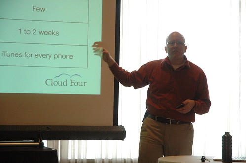
Up against Frank was Jason Grigsby with Web vs. App vs. Hybrid in a packed room. Jason approached this heated topic by telling the story of a decision they made at Cloud Four — should they become an all-native development shop? There are advantages to going all web and to going all Native. If you need great performance or are building something like a game, native is the answer. If your budget is limited, go web app. But really, it's much less black and white and is more a spectrum of solutions? As Jason said, his answer to the question "Native or Web?" is "Yes." Oftentimes a hybrid approach is best.
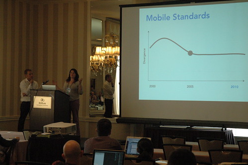
In The Future of Cloud Service Integration in Mobile Devices Josh Campbell and Elisa Vargas jointly talked about MotoBlur, and the future of cloud integration. There are a lot of things that the cloud can do well, and a few things that it can't; the trick is in figuring out what those strengths and weaknesses are. Most of those weaknesses can be handled by caching important data locally, and MotoBlur was designed to take advantage of exactly that.
Ian Homer in his talk UI Development for Multi-channel Web went over a method of implementing web apps that are customized to the devices you choose. After deciding the classes for the various devices, you start with a baseline and then lay over enhancements that suit the device you will be serving the content to. For example: say you want different nav for the iPhone version of the site than you do for the one that gets served to a RAZR—you could do that. Ian's company, Bemoko, has implemented this approach in their product BemokoLive.
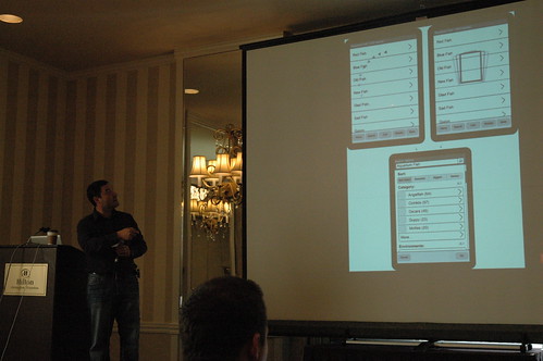
After the afternoon break, in Designing Resourceful Mobile E-Commerce Search Greg Nudelman put forward an excellent argument on why we should kill all the lawyers... or at least why we should understand just how much information and wasted time our mobile users are willing to handle. Search is also very important, and app makers should know that “Zero search results is not an error, its a natural effect in a system that deals with users.”
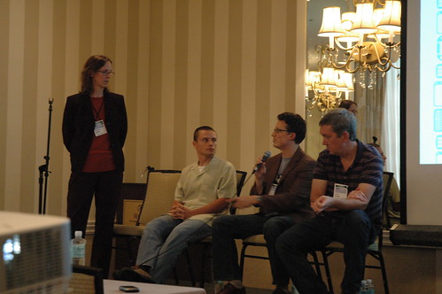
Finally, in Why and when to design for mobile first a panel of experts (Luke Wroblewski, Steven Hoober, and Scott Jenson) moderated by Barbara Ballard. Most of the discussion was a lively argument for Mobile First, and why mobile browsers have a strong chance of overtaking and leaving the desktop web in their dust. There was also a lot of discussion on what leading competitors and mobile companies are doing with their mobile experiences (both for better, and for worse).
No comments:
Post a Comment