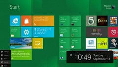
 Windows 8 is, conceptually, at the presentation level, an offshoot of concepts we've first seen in Windows Phone. And Windows Phone (like everything else in the world) has been evaluated (by tech columnists) as a straight-up iPhone competitor. I gather that Dvorak thinks some people sat in a room in Redmond and went "I've got it! We'll make all our icons square, and blue! That'll differentiate it from that darned iPhone. We'll show those meddling kids!"
I don't work for Microsoft, and didn't do any work on any of this UI. In fact, before we go further, I don't own one of these, and don't particularly have a warm place in my heart for Microsoft. But fair is fair, and I'm judging this on it's merits, as I see them. As soon as Windows Phone was announced (as I recall, even before we saw images) it was pretty clear that they were taking a quite different, not just putting their spin or skin on the "compete with Apple." I think it's a rather good approach.
If you design the system (any system, of any size) to be entirely about running applications, then your application discovery method better be solid. When Dvorak talks about how he recognizes icons, or accuses Microsoft of all but switching to a DOS CLI, this reveals his misunderstanding of how mobile (and some other clever systems) can work.
Instead of finding and running apps, you can be served information immediately and contextually. Skipping the bigger discussions of push messaging and contextual surfacing, Windows Phone (and I presume from the images, Windows 8) tiles are widgets (ask me later why this links to "icon"). Widgets, in this context, present little snippets of data, or even useful bits of data next to other bits of data. Immediately. Without having to explicitly launch them.
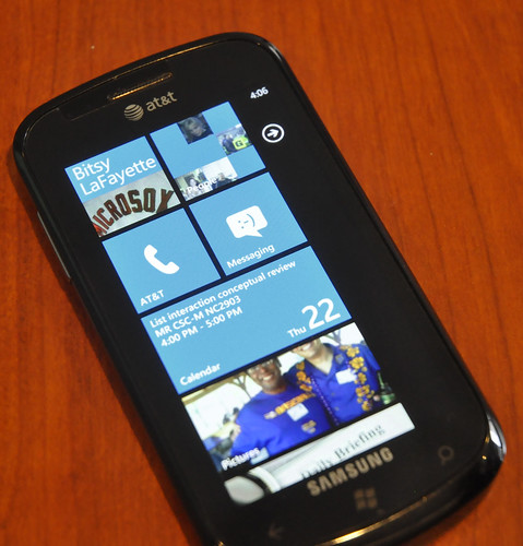 Aside from generally observing everything I can about mobile, I have a Windows Phone user right next to me at work. I asked him today to demonstrate, and he demonstrated exactly this use of it.
I can just open it up, and look at it, and scroll to get more information. If I need to know who did that, I look to the side and there they are.And no, he's not a designer, or particularly a mobile guy, and I didn't set his phone up for him. I've never even touched it. Based on many other observations I have made of all sorts of mobile users, a lot of them use their devices this way. You don't drill into the app, or even launch it. You just un-sleep the screen and glance at it. Maybe, just maybe, you have to scroll a little ways. Or, I claim from all these, they want to. I still feel the same way I did about Widgets in 2007
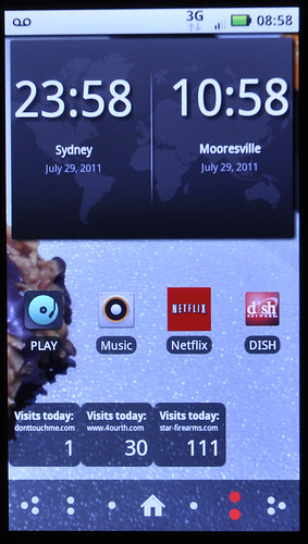
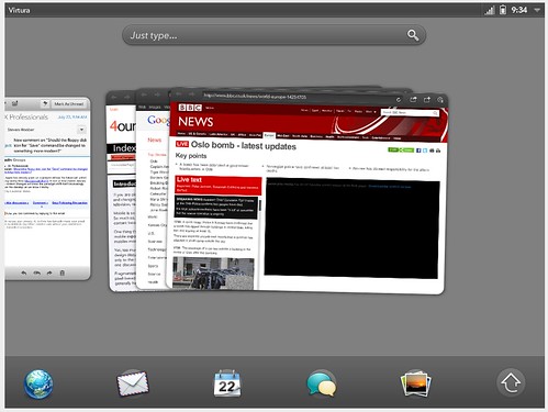 Forcing users to scan a grid of icons is, to me, not just a failure on mobile, but is a demonstrably secondary action in desktop systems. Think of the Applications folder on OSX, or the All Programs link in Windows. This is not the high use case, and is a simple fallback for when you need to get to something obscure, or which you cannot find otherwise.
And how to get around this? Search, launch bars, recently-used application lists, and other methods to allow the user to find the most likely applications. With a distinct move towards doing this automatically for users, instead of assuming they will set it up for themselves (because they won't).
Someone will probably see this as an assault on iOS. And I am fine with that. Aside from being comfortable with fanbois interpreting everything non-glowing as villainous, this is behavior I have observed; satisfaction does not always correspond to task completion, much less efficiency.
And it's not evolutionary. This is a twisting path. A lot of stuff much older than this let you prioritize better than just "what is on the first page of the app listing," like say S60:
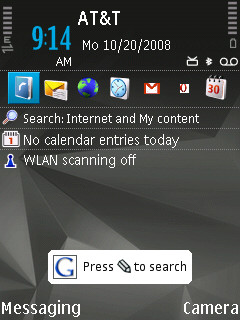 Darn it, I did mention Symbian after all. Oh, well. But since we're comparing to Apple, let's talk about another common refrain against Windows Phone – that it's over-designed. In the sense that it's designed to look good to executives approving it, to focus groups, or is just a misguided visual designer's wet dream. There are a number of ways in which I disagree with this, and find it to clearly have been well thought out by some pretty clever UX designers and IxDs.
The first has even been pointed out by some who dislike it. The device has pretty notable, integrated teasers of additional function or content. Tiles are partly displayed on the edges, animations help communicate what the interface can do. Even that big dead space to the side is about leading you to change panels to the right.
Another key one (there is lots of hate) is about the density of information. Those big words bug everyone, because they are not efficient. Compare the number of characters, lines of info or anything else you want to almost any other device and it comes out behind. Or does it? When I think of a lot of the use of mobile, even though context doesn't matter anymore, I see a lot of glanceable use.
My co-worker, for example, will regularly use his phone on the way to a meeting. Large text and images as iconic representations helps him use this on the go. I have noted, a lot more than any of the devices I am using. I sometimes have to stop to read where the room is, on my high-density information display. While we're at it, those giant, wasteful black gutters between tiles, they seem to help reduce click errors (and improve confidence of clicking) in all environments.
I have seen the design of Windows Phone disparagingly described as being like poster art. Which I say is a good thing. Posters work.
A question I assume many of you will ask is: Why isn't Windows Phone the market share winner? Well, lots of the usual reasons. Marketing, price, distribution, hardware, networks and operators, and so on. By no means does the best device win. Everyone seems to now be comfortable with OSX devices selling in their non-dominant market, so think about that. I'll tell you that a lot of these relatively niche devices (like WebOS or Windows Phone) are beloved by most users of them that I know, or have interviewed for research. They give them up due to unavailability, or lack of key apps or some other aspect outside the core interactive design paradigm. But also, we may be getting there. Android is doing rather well, and if you were inclined to, you could say it's because they support widgets, and this flexibility of layout is at least part of the success. I actually cannot find a useful "reason I chose Android" study to say that, and it's possibly untrue, but everyone else lies about statistics to prove their point. So I say that Android wins because the idle screen is more flexible and can be more mobile-optimized (I actually /do/ talk to end users who say this is why they chose it). And even more importantly, tomorrow is the future. Mobile, more than other technologies, changes all the time. And often in unexpected ways. On Thursday, a new head for HP. Is WebOS on the way back? Or this recent InfoWeek survey of mobile OSs (available at their site, but thru a subscription wall so the link may or may not be good) that shows Windows Phone perceived as just a tidge less useful to the IT professional than iOS. The future doesn't even have to be a variation on what we have today. There are OSs on the market off in other corners of the world you might not have heard of. Speaking of Itai, his Else phone prototype was a shockingly amazing piece of design in every way; I see no reason something that radical cannot make it to market sometime and surprise us all. Or maybe the web will take over, and the device OS won't matter. Or… something else. I have no idea what tomorrow will really bring. But it won't be more grids of icons.
For more on designing widgets, or just making those bog-standard lists and grids the best they can be, check out our forthcoming book Designing Mobile Interfaces. Pre-order from Amazon for a significant discount, or read the content online right now.
1 comment:
I think If you design the system (any system, of any size) to be entirely about running applications, then your application discovery method better be solid. When Dvorak talks about how he recognizes icons, or accuses Microsoft of all but switching to a DOS CLI, this reveals his misunderstanding of how mobile...
Cell Phone Watch
Post a Comment