Ever since mobile became really, really cool when the iPhone came out and every designer could happily show off their mobile credentials by having the latest one, there has been an influx of great new ideas accompanied by pithy little catchphrases. I've been somewhere between suspicious and dismissive of many of them, sometimes fairly publicly.
For all the good it does. Here I am mentioned being perceived as agreeing with Mobile First alongside Luke Wroblewski and Scott Jenson, up on stage no less. I never really did.
But lately I've been presenting a bit, and otherwise talking to folks all over the place, and therefore thinking more about many of these topics. First is that I promise I've never just been deliberately contrary, but none of my specific arguments ever stuck that well. And second you should know that I do not just make assumptions, but try to get to root meanings in order to act on information and do my job better. Just check out my work or how long the book is for proof. You can't shut me up when I get on a topic.
I also get tangential. Back on topic, I think that I'm suspicious and not embracing of a lot of these catchprases largely because I have gotten into this field differently than some others. I did art and graphic design from the time I could pick up a pencil, but was engineering-focused from Jr. High onward. I did grant-funded aerospace research in High School. I was the first researcher in the water tunnel at Wichita State University. But when I got to college I sucked at statics & dynamics, and some of the math, so eventually had to leave the program and fell back to art. Learned a lot of good stuff about competitiveness, criticism and understanding design reasoning there, so it was good in the end. I did graphic design work before I even graduated, which immediately (1995) was followed by "can we make a website also" requests from clients. Over a couple jobs I moved from my previous understanding of holistic design to true interaction, human factors, HCI and the emerging fields of UX. I formed teams and we taught ourselves how to be good designers of interactive systems.
So, despite pretty much getting into mobile from the web design side, it always involved data being fed from old systems, terminals for customer care reps, or email, or mailers or magazines. Or often, several of these.
I've been designing for multiple devices forever, since at least the late 1990s. The same stuff in print, CD, TV, web. Envelopes to put the brochure into. Etc. For another currently-cool example, I've been doing little hacks to dynamically resize and reflow content to different browser windows for years – so much so I keep forgetting that it's now called "responsive design."
If you think any one screen, size or channel solves your problems, think again. Netflix has to have a TV UI, sure. But have you noticed the Wii has a browser? Or what if Google TV stops being terrible, or Apple does break into TV in a big way after all? You'll need a 10-foot UI version of your website, and it's no longer just a real big PC monitor; just Monday, a report that console games are the #1 way to get online content to the TV. You might need a TV UI version today. Or yet another app for yet another audience. Technology isn't done growing, and sticking to any one technology is as bad as any other.
I've started calling this – at first somewhat by accident – "design for every screen." As you read on you'll notice it's not quite true, so I admit it's my own clever phrase. But it's closer than a lot of others, so I'll stick with it.
Devices and Channels
Another one of those marketable bits of phrasing from the past year or so was deciding that mobile context is no longer interesting. So I'll admit right off we're closing in on what I always called context. But "mobile context" has itself become saddled with improper assumptions of its meaning. Instead of throwing it away, I think we need to resurrect it.
Partly, because I cannot think of a better word. But also because I've been using the phrase for at least a decade. I went and looked a few weeks ago, and indeed have design documents from 2001 talking about the context of use. These were about the difference between consumers, several types of account managers, and call center employees, each of which had different levels of knowledge, training, etc. For a desktop web interfaces. And some had different use contexts, on the road, in an office, on specific hardware we knew about.
Mobile just added one more context when (around this same timeframe) I started tacking on mobile interfaces to the account management portals. But the then it added dozens. Doctors are not financial analysts, even if they both live by SMS and BBM. The growing variability in use of mobiles made them just like the desktop web. Meaning, lots of them.
Sure, there are some special contexts, because you use them wherever you are, instead of at a workstation of any sort.
And, the variability is bigger than you think. How many touchpoints do you have with a typical service, or company? Paper and ebills, other mailers, websites, and that's all supporting, before I get to the actual service which might be on the web or an app or a set top box. And more all the time: I watch TV on the website for my satellite provider more (when traveling at least) than through the set-top DVR.
Let me get back to some specifics, so we can talk about real products instead pure philosophical arguments. In the mid-2000s, I spent a long time doing a series of billing and account management projects, basically centered around some web portals. But only centered there; lots of other access points existed:
- Desktop consumer web
- Mobile web
- Mobile app
- Store terminals
- Call center terminals
- Call center logging
- Call center voice communication to the customer (scripts, etc.)
- Kiosks
- Printed bills
- Bill inserts
- Envelope printing
- Emails
- SMS
- IVR
- And probably a couple more I forgot.
When I look back at my project files, it turns out most projects I work on are multi-channel, even if not multi-device. If you are just making an app, it's hard to not have a website, optimized for both desktop and mobile. And you better think of how it will look in app store, and how it installs. And... so on.
Design for Every Input
How about design for every input? I spend a lot of time reminding everyone that it's not just touchscreen, but also scroll & select; even lots of touch devices have keyboards and the very large category of messagephones are just 10-key scroll-and-select devices when folded. If you pretend everything is touch only, then your app looks stupid when it won't work right with the keyboard out.
But did you remember other inputs? Take a video sharing service (like some I have worked on). Why make users go to the desktop web or download an app, just to upload? We added MMS and Email services. Send to a specific address, and it goes into your account. And, this worked great. These are popular services. Do I need to remind everyone that Twitter is an SMS-based service? How can you leverage other channels to allow user input?
If you are not following my logic here, it's just an extension of the previous thoughts that everything is slightly more complex than it appears at first. Even if you stick to the desktop, web is just one input/output channel. You send customers emails, and then they can respond. They can call you. They send back bills in paper, no matter how much you wish they wouldn't. This is all part of the experience and you better address it all at the same time.
Design for Every Screen
Generally, when I talk about these principles, everyone agrees. I come away from client meetings with a task to show some multi-channel scenarios, or permission to architect the system with device agnosticism, so we can discover the right channels organically. And that works fine.
But like a lot of my processes, it doesn't work so well when I task others to do the same thing in my stead. I'll even make those basic deliverables, and then move on to another project while just supervising further design development. And it still falls down. So, we need to come up with some methods by which design for every screen can be carried out.
Well, not really. Because they already exist. Pretty much every design methodology will work just fine. Process I have published work fine, but let's go more generic. How about some basic tenents of UCD. If you can find a definition that doesn't get all hung up on a channel (really, Usability.gov only websites need to be designed?) you will find some of the same principles I've been talking about:
- Audience – Personas, and anything else you can use to determine
- Purpose – Use scenarios and use cases to understand how the product will be used, what tasks and goals exist, and what features will be helpful to get there.
- Context – Yup, we're back to contexts of use again. And, you'll see again that context is a fundamental to understanding the use of using any system, not just mobile.
The difference between a lot of practice with these processes, and what I want you to do is two-fold:
- All answers are valid – Do not set constraints, or make false assumptions. Let the process lead you to audiences, purposes and contexts you might not have thought of.
- Actually follow a design process – This is key. No one does a design process anymore. Even people who gather at monthly meetings to talk about how great process is, read books and chat about it, end up just sketching ideas immediately. And the sketches are in their domain; if you are a web designer you make a desktop website, if you are a mobile designer, you make an iPhone app. Always.
To reiterate: cut it out. Pop open books if you need to, but gather information, answer your basic questions and develop whatever else will help you. Even if quick and dirty I say you should always be putting problem statements, principles of design and personas up on the wall. At the least. And you can do this in about two hours if you need to. It's not something that has to take six weeks, or six months.
Design for Target Experiences:
There's a third facet you'll need to stick to also, but it's less about principles than communicating to clients, so I didn't include it in the list. You may have already figured it out, and are sneering at my rainbows-and-unicorns world where everything we want gets built. In reality, of course, there are time/people/money budgets, and only a few things get built. So, you are still only getting a website
At first. You, as the designer, need to keep saying "the first release will..." and then keep putting up IA diagrams of the target experience. This is a great phrase. Unlike "problem statement" or some other things that cause grief and need euphemisms, "target experience" goes over great for all levels of IT and business folks. We want to be here, but we also know that pragmatically, we can only go this far... today. Keep saying it like that. Be and act realistic about the whole thing and you'll be surprised how much you get snuck in.
And not in an evil sneaky way. "Sneak in" would be one of those phrases you do not use in front of the clients. What I mean is, go back and look at some of those inputs and channels above. Your product will have email, SMS, printed bills, customer care. Or at least a few of these. Nothing is a pure website. So when you design for every screen, you are not surprised by a sudden request to make the email messages not terrible, 3 months after launch. You designed that, along with all the right error messages, and an easy upload scheme, right from the start. If it's getting built anyway (like outbound email), then your design goes in on the first phase.
That is because this also works very well with a lot of product development and software development processes. They like plans. Agile, for example, actually has a backlog of features. You can simply fill up the next 18 months with features, immediately. You are not perceived as annoying and overbearing, but as a go-getter, trying to make the product as good as it can be. The first person to show up with a list of functional requirements (or Stories, or Features, or whatever) has more influence over the final output than is immediately obvious.
Design for Change
Of course, you will learn as you go along. And you will learn you were wrong. User tests, analytics, customer-satisfaction scores, close rates, will all tell the real picture. Your second phase will become less important, and something else pops up, for example. But you will look okay, as you've got a target experience. Which is just a target, you must be willing to shift to the data, and say that out loud.
And, you will not be surprised by this – at least not entirely. Because your multi-channel, IA-based target experience looked at everything. You've at least got a sketch and a set of bullet points. When research comes back with a recommendation that you are years behind the times, and you better do something better than Usable.net for your mobile site, you can pull that out and be helpful and speedy.
As long as you are not "told you" and all arrogant about that. There's a limit to how much you can trust my client-relationship advice.
Implement for Every Screen:
A key gap to getting a good, holistic experience still exists: the gulf of execution. No, not Don Norman’s gap between stimulus and understanding, but the difference between what you give design and what comes out of the development team. I'll come up with a good phrase to replace that, someday.
I know some of you develop their own code, already has a terrific relationship with their developers, or believes your process solves all. I’ve been there and say: Some day it won’t. Even if everything is wonderful, can it be better? Usually. Even if not enough to mess with, find out why it works so you can fix your next company.
For everyone else, there's hope. And not the passive hope that this next development process or corporate reorg fixes everything. They will embrace your principles, which for this stage we can define as:
- Design holistically – Systems, not pages, not widgets, not buttons. Just like I've been saying, design extensible, system-agnostic architectures, and end-to-end experiences.
- Develop good objectives – Tie to the enterprise, and the product owner, but develop objectives for the team to embrace, and which can be achieved by them, and by the product you are building today, and tomorrow.
- Own your design – You can't just put a target design on the wall. You have to believe in what you give to them (without changing your mind halfway through the release), and you have to keep reminding everyone to implement the existing plan with each future release.
- Get everyone to buy into it – You can't do it alone. Even if it means adjusting or even collaborating get a plan and design everyone can get behind. Not just live with, but actually believe in.
I've developed a few tactics over the years to help with this. Actually, a lot more than this, but these are the key ones. And they aren't a trick or a stretch. The design process I've been talking about, the process you have worked through to get the the implementation stage is very much in line with good software development. All this makes sense to implementation teams.
- Don’t walk away – Always stick with the project through development, at least making yourself available for questions, rework, changes and testing. Ideally, become integrated into the team, and attend daily meetings, test planning, and so on. Plan on this from the start so your schedule and budget accounts for it.
- Set goals for everyone – Those business and user goals you should have developed at the beginning of the project must be translated into actual, measurable metrics. Then, try to make sure they get measured. Push for these to be the project level measure of success for the whole organization, instead of cost savings, efficiency of developers, or other internal measures.
- Make object-oriented designs – Sometimes this is just called “modular re-use,” or other things, as “object oriented” is a larger set of principles (it all originated in development) and might confuse development. But I like the sound of it. The core concept is the same: Instead of designing every detail for every state, and building by state or building hundreds of items to bolt together, a few dozen modules are built and re-used over and over in common templates. Easier on you, and easier on development if they work that way.
- Practice polymorphism – Sorry, it's another of my troublesome words; this time, not bad, just meaningless to many people. But developers tend to love it. Essentially, variations of objects are still the same object. If there are several variations of an on-screen module you design, make sure you express them as variations of each other so these are clear. This is a polymorphic item. Of course, if there is only one variant (omnimorphism) then that should be explicitly stated as well. Always keep in mind efficiency and re-use.
- One IA for all – As discussed at great length above, a single IA diagram will give everyone a single, simple concept to hang onto. Enough, that developers will stick it on the wall of their cube. This is the best you can hope for; most developers won't put design objectives or personas on the wall, but this isn't bad.
As I said, there are other tactics and facets to remember, but they start getting pretty detailed again, so are almost a side conversation. Don't forget branding, and to communicate in a single voice. Good design will automatically be accessible, multi-platform and easier to manage and implement. And so on. I suspect if you have a design/implementation tactic, I believe in it also, and just say: don't forget to add it to your checklist, and start thinking about it as early as possible.
I have used a lot of my own experiences above. But those, and the long time I have been in mobile (or doing these other things) is not even important. I have worked with others who had their first mobile experience while I watched, well into the everything-is-a-smartphone era. And if they have a similarly technical background, or a systems-thinking approach, they do just fine approaching the design not as mobile first, but appropriately, bottom-up, and with every interface and interaction the end user needs.
Anyone can, and should be designing for every screen, every input, every device, and every context.



 Yeah, maybe this is old hat for everyone else, but I've never actually bothered to incorporate anything before. I just faked it, filed a Schedule C and made do. Accountant friends forced my hand here for tax reasons, but really it's a good idea.
So, consider this the official announcement: 4ourth Mobile is a thing. Call it a virtual mobile design agency. If you think well of one of our tweets, or blog post, or
Yeah, maybe this is old hat for everyone else, but I've never actually bothered to incorporate anything before. I just faked it, filed a Schedule C and made do. Accountant friends forced my hand here for tax reasons, but really it's a good idea.
So, consider this the official announcement: 4ourth Mobile is a thing. Call it a virtual mobile design agency. If you think well of one of our tweets, or blog post, or 
 Yeah, just the line of new products. But that's it. A whole line of products. A new low-end, improvements to the e-Ink, removal of the keyboard (more on that later). Not just retaining the old models, and maybe lowering the price, just to appeal to cheapskates.
You'd think that based on rumor, and pretty much every other review or comment coming up to this, or today.
Yeah, just the line of new products. But that's it. A whole line of products. A new low-end, improvements to the e-Ink, removal of the keyboard (more on that later). Not just retaining the old models, and maybe lowering the price, just to appeal to cheapskates.
You'd think that based on rumor, and pretty much every other review or comment coming up to this, or today.
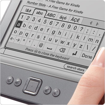 Not just because my PVR does it, or my GPS, or I examined a lot of products and it's just a way to do it, not that... Oh, yeah. Because the new low-end Kindle uses that exact system.
And why? Hell if I know. I don't work there. I'd guess that they found people don't type as much as expected. And it helps make the price point, and so on. They don't do this stuff randomly.
Not just because my PVR does it, or my GPS, or I examined a lot of products and it's just a way to do it, not that... Oh, yeah. Because the new low-end Kindle uses that exact system.
And why? Hell if I know. I don't work there. I'd guess that they found people don't type as much as expected. And it helps make the price point, and so on. They don't do this stuff randomly.
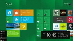 Windows 8 is, conceptually, at the presentation level, an offshoot of concepts we've first seen in Windows Phone. And Windows Phone (like everything else in the world) has been evaluated (by tech columnists) as a straight-up iPhone competitor. I gather that Dvorak thinks some people sat in a room in Redmond and went "I've got it! We'll make all our icons square, and blue! That'll differentiate it from that darned iPhone. We'll show those meddling kids!"
I don't work for Microsoft, and didn't do any work on any of this UI. In fact, before we go further, I don't own one of these, and don't particularly have a warm place in my heart for Microsoft. But fair is fair, and I'm judging this on it's merits, as I see them. As soon as Windows Phone was announced (as I recall, even before we saw images) it was pretty clear that they were taking a quite different, not just putting their spin or skin on the "compete with Apple." I think it's a rather good approach.
If you design the system (any system, of any size) to be entirely about running applications, then your application discovery method better be solid. When Dvorak talks about how he recognizes icons, or accuses Microsoft of all but switching to a DOS CLI, this reveals his misunderstanding of how mobile (and some other clever systems) can work.
Instead of finding and running apps, you can be served information immediately and contextually. Skipping the bigger discussions of push messaging and contextual surfacing, Windows Phone (and I presume from the images, Windows 8) tiles are
Windows 8 is, conceptually, at the presentation level, an offshoot of concepts we've first seen in Windows Phone. And Windows Phone (like everything else in the world) has been evaluated (by tech columnists) as a straight-up iPhone competitor. I gather that Dvorak thinks some people sat in a room in Redmond and went "I've got it! We'll make all our icons square, and blue! That'll differentiate it from that darned iPhone. We'll show those meddling kids!"
I don't work for Microsoft, and didn't do any work on any of this UI. In fact, before we go further, I don't own one of these, and don't particularly have a warm place in my heart for Microsoft. But fair is fair, and I'm judging this on it's merits, as I see them. As soon as Windows Phone was announced (as I recall, even before we saw images) it was pretty clear that they were taking a quite different, not just putting their spin or skin on the "compete with Apple." I think it's a rather good approach.
If you design the system (any system, of any size) to be entirely about running applications, then your application discovery method better be solid. When Dvorak talks about how he recognizes icons, or accuses Microsoft of all but switching to a DOS CLI, this reveals his misunderstanding of how mobile (and some other clever systems) can work.
Instead of finding and running apps, you can be served information immediately and contextually. Skipping the bigger discussions of push messaging and contextual surfacing, Windows Phone (and I presume from the images, Windows 8) tiles are 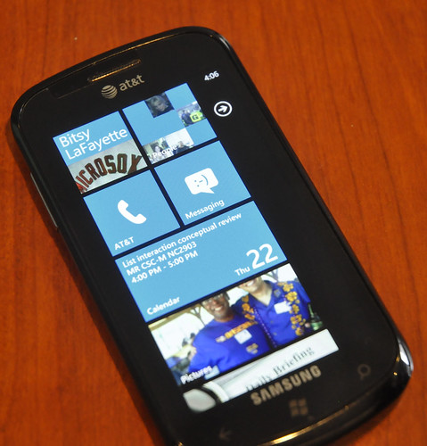 Aside from generally observing everything I can about mobile, I have a Windows Phone user right next to me at work. I asked him today to demonstrate, and he demonstrated exactly this use of it.
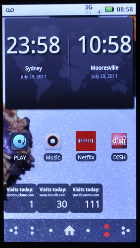
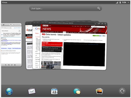 Forcing users to scan a grid of icons is, to me, not just a failure on mobile, but is a demonstrably secondary action in desktop systems. Think of the Applications folder on OSX, or the All Programs link in Windows. This is not the high use case, and is a simple fallback for when you need to get to something obscure, or which you cannot find otherwise.
And how to get around this? Search, launch bars, recently-used application lists, and other methods to allow the user to find the most likely applications. With a distinct move towards doing this automatically for users, instead of assuming they will set it up for themselves (because they won't).
Someone will probably see this as an assault on iOS. And I am fine with that. Aside from being comfortable with fanbois interpreting everything non-glowing as villainous, this is behavior I have observed; satisfaction does not always correspond to task completion, much less efficiency.
And it's not evolutionary. This is a twisting path. A lot of stuff much older than this let you prioritize better than just "what is on the first page of the app listing," like say S60:
Forcing users to scan a grid of icons is, to me, not just a failure on mobile, but is a demonstrably secondary action in desktop systems. Think of the Applications folder on OSX, or the All Programs link in Windows. This is not the high use case, and is a simple fallback for when you need to get to something obscure, or which you cannot find otherwise.
And how to get around this? Search, launch bars, recently-used application lists, and other methods to allow the user to find the most likely applications. With a distinct move towards doing this automatically for users, instead of assuming they will set it up for themselves (because they won't).
Someone will probably see this as an assault on iOS. And I am fine with that. Aside from being comfortable with fanbois interpreting everything non-glowing as villainous, this is behavior I have observed; satisfaction does not always correspond to task completion, much less efficiency.
And it's not evolutionary. This is a twisting path. A lot of stuff much older than this let you prioritize better than just "what is on the first page of the app listing," like say S60:
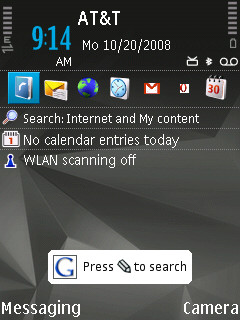 Darn it, I did mention Symbian after all. Oh, well. But since we're comparing to Apple, let's talk about another
  I see it used by those who distribute involved raster PSD templates for designing on a specific device, or write up long explanations of how to use Fireworks for mobile design, or who push or promulgate pithy catchphrases like "mobile first," (or "CLI first") really. They often routinely conflate interaction and interface design, or just call themselves "designers" without distinction. Many work at companies who hire designer/developers, or cannot fathom what a designer does if not also writing code, or at least prototyping everything, as soon as possible.
Yes, I am enough of a taxonomist to know that generalizing results in generalizations. I don't much care about individual cases. But if you want to talk specifics, I have seen at least three well-meaning, otherwise mostly-useful repositories of information refer to 44 px as the right touch target size this year. If you are not horrified by that, turn in your HCI credentials. You may have noticed that people cannot be measured in pixels. So it was dumb a couple years ago when there were too many Apple fanboi designers. But now even iOS has multiple resolutions. Saying "44 px" without caveat, in 2011, should be tried in the International Criminal Courts at the Hague.
It all reminds me of 1999. That's when I started seriously – in front of clients – rejecting the concept of the "page fold" in web design. By way back then even the desktop was becoming too fluid or fragmented to pick a screen size for everyone that was the same. Anyone who starts with a single resolution for mobile is fooling themselves, and wasting opportunities.
Without over-emphasizing the point, designing in pixels is dumb. Anything that reinforces or just trys to improve designing in pixels is also dumb.
Note that I didn't say we don't need Photoshop. It's open alongside InDesign all day, every day. And I in no way said we don't need visual or graphic designers; I have an art degree, and have won awards for digital art and illustration, but it's not my day job today, and I need that sort of designer to collaborate with. I said "designing in pixels" is bad. Don't over-reach and miss the point.
I see it used by those who distribute involved raster PSD templates for designing on a specific device, or write up long explanations of how to use Fireworks for mobile design, or who push or promulgate pithy catchphrases like "mobile first," (or "CLI first") really. They often routinely conflate interaction and interface design, or just call themselves "designers" without distinction. Many work at companies who hire designer/developers, or cannot fathom what a designer does if not also writing code, or at least prototyping everything, as soon as possible.
Yes, I am enough of a taxonomist to know that generalizing results in generalizations. I don't much care about individual cases. But if you want to talk specifics, I have seen at least three well-meaning, otherwise mostly-useful repositories of information refer to 44 px as the right touch target size this year. If you are not horrified by that, turn in your HCI credentials. You may have noticed that people cannot be measured in pixels. So it was dumb a couple years ago when there were too many Apple fanboi designers. But now even iOS has multiple resolutions. Saying "44 px" without caveat, in 2011, should be tried in the International Criminal Courts at the Hague.
It all reminds me of 1999. That's when I started seriously – in front of clients – rejecting the concept of the "page fold" in web design. By way back then even the desktop was becoming too fluid or fragmented to pick a screen size for everyone that was the same. Anyone who starts with a single resolution for mobile is fooling themselves, and wasting opportunities.
Without over-emphasizing the point, designing in pixels is dumb. Anything that reinforces or just trys to improve designing in pixels is also dumb.
Note that I didn't say we don't need Photoshop. It's open alongside InDesign all day, every day. And I in no way said we don't need visual or graphic designers; I have an art degree, and have won awards for digital art and illustration, but it's not my day job today, and I need that sort of designer to collaborate with. I said "designing in pixels" is bad. Don't over-reach and miss the point.
 I like words also. If I can get them, well-formatted bullet lists are nice, but if I have to just boxes and words will do nicely. Two pixels together are two pixels. But two boxes together are nested. or adjacent, or overlapping. They interact. They can move. One can conditionally disappear.
 Don't even get me started on the possibilities offer up by three boxes. The mind boggles.
What size are they? It doesn't matter. Or: it depends. On rules we don't just assume, or constrain by declaring a resolution, but by determining some what size and what items stay on each page in which position as the design progresses into addressing different platforms, different devices, and different aspect ratios.
This is all based on every other type of design or drawing or illustration I have done or learned. You start with basics and move into details. You start with sketches and settle on aspect ratios, orientations and sizes. Details get filled in as it evolves.
So few artists start their work at full detail in one corner that it's generally studied as a condition. Whereas I have seen an awful lot of interface designers start by laying down a gradient bar at the top of the page, pick the color and type the title in, then proceed from there.
Don't even get me started on the possibilities offer up by three boxes. The mind boggles.
What size are they? It doesn't matter. Or: it depends. On rules we don't just assume, or constrain by declaring a resolution, but by determining some what size and what items stay on each page in which position as the design progresses into addressing different platforms, different devices, and different aspect ratios.
This is all based on every other type of design or drawing or illustration I have done or learned. You start with basics and move into details. You start with sketches and settle on aspect ratios, orientations and sizes. Details get filled in as it evolves.
So few artists start their work at full detail in one corner that it's generally studied as a condition. Whereas I have seen an awful lot of interface designers start by laying down a gradient bar at the top of the page, pick the color and type the title in, then proceed from there.
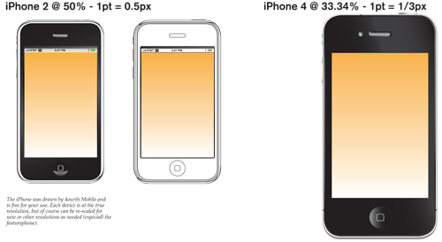 I've added an iPhone 4. Keeping to the resolution scaling didn't work for the doc size, so I had to make it different. Keep in mind. Just noticed I didn't get an annunicator row into the 4... Oh well. Sure, there are lots of places that have iOS device stencils, but if you like mine, now you have one.
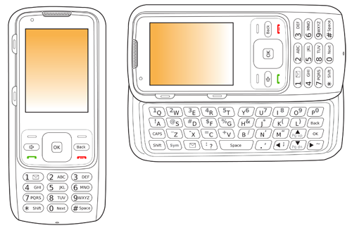 Compared to the smartphone fanbois, not everyone has this one. A featurephone. Specifically, a convertible one with 10-key one way, and a slide out keyboard. This is in outline mode only right now, but I will probably shade it someday, and will post that as well of course.
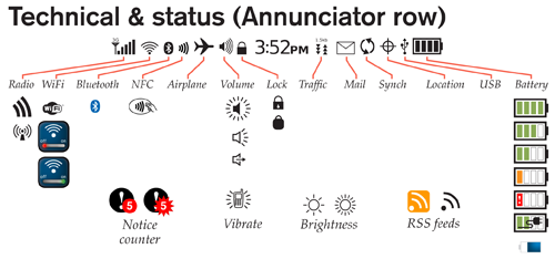 Speaking of annunciators, I am trying to not just add items, but to organize them. So, all the system status items I could think of (actually, which resulted from research for the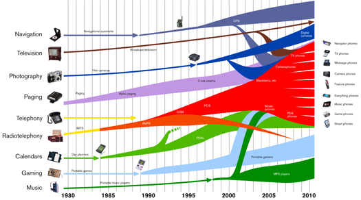
 This makes me insane, though. It looks precarious as hell, and tell me why on-screen help isn't a better solution? Or, maybe just fixing the interface so you don't need so much help. I wonder how many fatalities this will cause. (Yeah, I noticed they are such boneheads they couldn't even load up a screenshot of the app for the promo shots, either. Just pretend).
I'd be fine with going so far as to just dock the hype machine to the car and using COTS hardware like an iPad as the in-car screen.
But three years from now, when the car breaks down, and you are trying to figure out the fuse panel in the middle of the night, what are the chances your iPad is charged? Is even in the car? After an accident (when, yes, tow truck operators sometimes need information on how to unlock the transmission) what are the chances that the screen is not smashed? Etc.
An owners manual is, apparently, perceived as an extension of the purchase process, and something every person will sit and happily read when they get home. In fact, this is a massive failure of understanding users, use cases and context. In the US, owners manuals are help lines. Referred to like you call customer care when your bill is confusing. And that doesn't exactly scream "free iPad for everyone" to me.
This makes me insane, though. It looks precarious as hell, and tell me why on-screen help isn't a better solution? Or, maybe just fixing the interface so you don't need so much help. I wonder how many fatalities this will cause. (Yeah, I noticed they are such boneheads they couldn't even load up a screenshot of the app for the promo shots, either. Just pretend).
I'd be fine with going so far as to just dock the hype machine to the car and using COTS hardware like an iPad as the in-car screen.
But three years from now, when the car breaks down, and you are trying to figure out the fuse panel in the middle of the night, what are the chances your iPad is charged? Is even in the car? After an accident (when, yes, tow truck operators sometimes need information on how to unlock the transmission) what are the chances that the screen is not smashed? Etc.
An owners manual is, apparently, perceived as an extension of the purchase process, and something every person will sit and happily read when they get home. In fact, this is a massive failure of understanding users, use cases and context. In the US, owners manuals are help lines. Referred to like you call customer care when your bill is confusing. And that doesn't exactly scream "free iPad for everyone" to me.
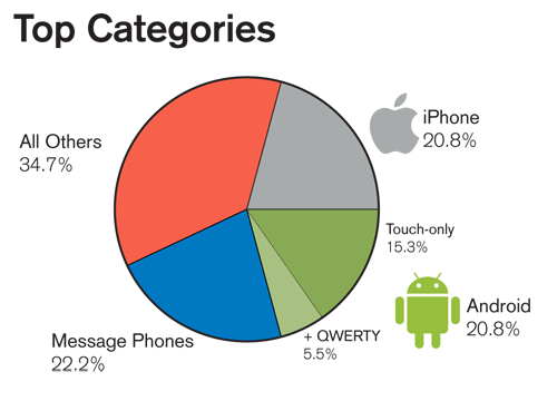
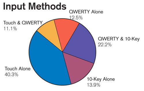
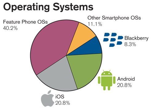 All the data I used
