A lot of people talk about mobile being "little glowing rectangles." But I think that frames the whole discussion wrong, because "little" isn't the key aspect of the device. And "rectangles" makes it too similar to the desktop, which is just a bunch of smallish rectangles (windows) inside a big one (the screen). What's different about mobile is the environment. I can be walking down the street, having dinner with friends, riding in a car. Or watching TV, and I keep wondering "who is that guy?" and instead of not knowing, or referring to a book, or going and getting on the computer, I can just pull out the mobile handset and look up this, or any other type of information, any time I want to. Mobile is contextual, in the sense that it works all the time, wherever you are, within your social environments, within the structure of the rest of your life.
The reason context is important is that it's what we live in all the time. Walking down the street, or driving to get a new license plate for your car. Putting aside your phone for a moment, you can understand context with analogies to other, actual interactions with the world. Like driving down the street, trying to understand traffic signs. Very near my house is a County building, where they do lots of stuff. Vote, get public health services, day care, crime lab, etc. And most people know it as the place where you go to get your new license plates, and pay the taxes for that each year. Most people who live in the area come here, but maybe once or twice a year. They come down the little street that passes by it, and as they approach it rings a bell. They can see the building, and they see a nice wide driveway to a parking lot. When they pull in, they see this:
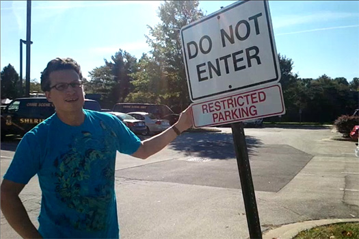 Actually, one on either side of the driveway. Off to the side is another that warns "Sheriff's Department Parking Only!" But how does anyone driving down the road know that. Because it was not placed usefully for the context of Driving Down the Road. The sign is aligned with the driveway, and is almost totally invisible (edge on) to people driving down the road.
If you aren't thinking about mobile design the same way, you are going to do the same thing. You are just putting up road signs in useless places also. It's easy to break up projects into pieces, and inherit process. It's easy to design for the way products are developed or built, or the way the old business process or legacy datastore gives the information to you. Or even just because you are designing it on a desktop computer, in that environment. And if you do this, you can easily forget about things like lighting conditions. Or the fact that minimum touch targets are only for sitting still, and people walking or in a bus have wobbling and vibration to fight with. You have consider the way people will actually use not just mobiles, but your mobile product specifically. Failing to do this will cause errors, frustration, and eventually people will stop using it. Sure, draw on the desktop, and use emulators and simulators to get the gist of things. But try your products out in real life. Bring paper mockups outside if you have to. Try competing products. But put them on phones and take them home, on the bus, and onto the street. Try them in the sun, in the dark before you go to bed. Take the bus or train for a change. Think about your users. Think contextually.

 This is actually one of the better signs I have seen on doors in my neighborhood. (Also note its at the front of an airlock. Any draft is already caught by the second set of doors, so its extra inexplicable). Its not very clear, so I end up tugging on lots of locked doors, which just a few weeks before I had been able to use.
On the other hand, take Taco Bell. Our local one (I don't go there, but its right at the end of the street) has been abandoned, and its moved across the street. But you know how fast food joints have an iconic nature; they look like that same place years later. Old Taco Bells still look like you can get tacos, even if they serve Chinese, or are pawn shops. What to do?
This is actually one of the better signs I have seen on doors in my neighborhood. (Also note its at the front of an airlock. Any draft is already caught by the second set of doors, so its extra inexplicable). Its not very clear, so I end up tugging on lots of locked doors, which just a few weeks before I had been able to use.
On the other hand, take Taco Bell. Our local one (I don't go there, but its right at the end of the street) has been abandoned, and its moved across the street. But you know how fast food joints have an iconic nature; they look like that same place years later. Old Taco Bells still look like you can get tacos, even if they serve Chinese, or are pawn shops. What to do?
 How about that? VERY large signs, make sure they are places that matter (e.g. the drive thru menu which is already attracting attention, and an expectation of reading), leave the lights on so the signs can be read, and make the message very, very clear. Its not /exactly/ across the street, but its so close you literally cannot miss it if you pull back out and look. No address, no diagrams, no arrows (typical for moved businesses). "Across the street." I find this to be a wonderful solution.
How else can exception messages matter? How's life and death? This
How about that? VERY large signs, make sure they are places that matter (e.g. the drive thru menu which is already attracting attention, and an expectation of reading), leave the lights on so the signs can be read, and make the message very, very clear. Its not /exactly/ across the street, but its so close you literally cannot miss it if you pull back out and look. No address, no diagrams, no arrows (typical for moved businesses). "Across the street." I find this to be a wonderful solution.
How else can exception messages matter? How's life and death? This