As we say in the preface to the book, very shortly into writing it, we faced a serious decision about how to illustrate the book. The all too typical answer for pattern libraries is to use screenshots. So, I tried that. Our trial pattern was the Carousel for several reasons. And the first thing I did was snag some examples, and put little green circles and red x's on them to indicate good and bad examples.
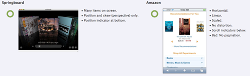 And... it didn't work that well. Not just to me, but as I showed it to Eric, and others, it wasn't clear what you were looking at. So, I added in the bullet lists to describe what is good and bad. But really quickly I figured out this wasn't that much better. Readers could still be confused, or draw the wrong conclusion about what makes it a good pattern. It might encourage rote copying of specific solutions, instead of approaching them as patterns.
And also, I was trying to solve a problem that I feel has already been solved. We all write up UI/IxD design specifications all the time. Why not wireframe the examples? I already had what I called a "mid-level" diagramming style, which I had used for essentially this exact purpose; when building IA diagrams, and having to depict modular elements in a system, this is enough detail
And... it didn't work that well. Not just to me, but as I showed it to Eric, and others, it wasn't clear what you were looking at. So, I added in the bullet lists to describe what is good and bad. But really quickly I figured out this wasn't that much better. Readers could still be confused, or draw the wrong conclusion about what makes it a good pattern. It might encourage rote copying of specific solutions, instead of approaching them as patterns.
And also, I was trying to solve a problem that I feel has already been solved. We all write up UI/IxD design specifications all the time. Why not wireframe the examples? I already had what I called a "mid-level" diagramming style, which I had used for essentially this exact purpose; when building IA diagrams, and having to depict modular elements in a system, this is enough detail
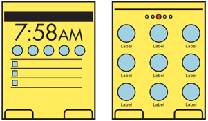 Sure, some of these are so simple they are almost painful. I actually have one that is a featureless blue rectangle! But that's all because I am trying to show off only what is most important about the pattern. If it's about the arrangement of icons, and the interaction between frames and other elements. The icons themselves will just clutter things up and confuse the issue so they are blue circles. Blue because there's a code to the colors, and blue is graphics. Yellow is available page items. Orange is in-focus. Gray is, well, grayed-out.
 If it's about an icon itself, sure, I'll have an illustration showing those details. Here, how it can be overlaid with more information.
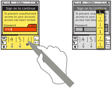 But mostly, they are screens. And later on in the book the patterns start building on each other, and getting more and more complex themselves. Many items are on each screen, as well as sometimes things like gesture (or here, pen) overlays to explain the input. But they are still as simple as can be to communicate the key parts of the pattern. Well, usually. The example above has a detailed annunciator row because... I forgot to remove it. But it is extraneous detail. Oops.
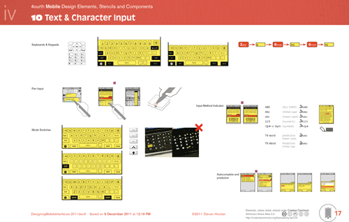
And we did after all include some screenshots and photos. We didn't avoid screenshots just because they were a pain to find and deal with. I ended up capturing over 1,500 images of devices, and their screens. And a huge number are photos of odd devices and featurephones. Just follow that link to the Flickr set for that hard-to-find screenshot.
But mostly, they are screens. And later on in the book the patterns start building on each other, and getting more and more complex themselves. Many items are on each screen, as well as sometimes things like gesture (or here, pen) overlays to explain the input. But they are still as simple as can be to communicate the key parts of the pattern. Well, usually. The example above has a detailed annunciator row because... I forgot to remove it. But it is extraneous detail. Oops.
And we did after all include some screenshots and photos. We didn't avoid screenshots just because they were a pain to find and deal with. I ended up capturing over 1,500 images of devices, and their screens. And a huge number are photos of odd devices and featurephones. Just follow that link to the Flickr set for that hard-to-find screenshot.
Anyway, what I am doing today – aside from telling you all about this – is sharing that document with you. Not just reminding you of the Mobile Design Elements document, but I have also posted the document I used to draw all the diagrams for the book. Not just as a PDF to browse, but the actual Adobe InDesign CS4 file so you can copy and edit them and use it in your own drawings.
 If anyone wonders if I have library files, Graffle templates or anything else: no. I work in InDesign, and I know a lot of others who do also. I get good download rates off InDesign. But, since it's freely shared (with attribution, read the CC disclosure on the document) you are free to convert it if you want to. People better at those other tools than me have done so in the past for my Mobile Design Elements.
And for those who don't know, you can also open PDFs in Illustrator, and can use PDF images directly in OmniGraffle (not place them, but open and edit in Graffle directly). If you need help or anything, ask. I also did export all these images as individual Ai files, so if someone thinks that they could use those instead, tell me and I'll zip them up also.
One caveat is that I'll be tweaking this a bit over the coming days. Well, maybe weeks, but hopefully just days. I am adding in the Figure numbers from the book, and otherwise cleaning it up a bit. But that is taking kinda forever, and it's 95% good, so instead of making everyone wait more, you can get it now.
If you didn't notice, there are two links above to directly download. Though I don't promise to remember to keep these up to date. It will always be posted in the same place as the other design stencils, you just go there for the latest copy.
If anyone wonders if I have library files, Graffle templates or anything else: no. I work in InDesign, and I know a lot of others who do also. I get good download rates off InDesign. But, since it's freely shared (with attribution, read the CC disclosure on the document) you are free to convert it if you want to. People better at those other tools than me have done so in the past for my Mobile Design Elements.
And for those who don't know, you can also open PDFs in Illustrator, and can use PDF images directly in OmniGraffle (not place them, but open and edit in Graffle directly). If you need help or anything, ask. I also did export all these images as individual Ai files, so if someone thinks that they could use those instead, tell me and I'll zip them up also.
One caveat is that I'll be tweaking this a bit over the coming days. Well, maybe weeks, but hopefully just days. I am adding in the Figure numbers from the book, and otherwise cleaning it up a bit. But that is taking kinda forever, and it's 95% good, so instead of making everyone wait more, you can get it now.
If you didn't notice, there are two links above to directly download. Though I don't promise to remember to keep these up to date. It will always be posted in the same place as the other design stencils, you just go there for the latest copy.
1 comment:
Great post full of useful tips! My site is fairly new and I am also having a hard time getting my readers to leave comments. Analytics shows they are coming to the site but I have a feeling “nobody wants to be first”. lehigh valley web designer
Post a Comment