Thursday, August 28, 2008
Who knew chemo was this annoying?
I've been working in a chemo administering cubicle for four hours now. For my dad. See other posts for earlier status and the general gist of things.
The cubicle is nice enough, but I never knew it took most of the day. At least his is like once a week for short bouts. He asked a nurse about it, and she said for some types of cancer you get daily nine hour treatments. Even if it wasn't extremely uncomfortable and tiring, just the schedule has to get to you.
On a side note, I'm in the Sprint World Headquarters. Well, in the sense that it'll always be Sandstone Amphitheater and National Airport. The old headquarters in Westwood is, among other things I think, an extension of KU med. The entrance on the west side is a cancer center specifically. Nice to see things re-used like this. Always liked the building well enough, and the way it was tucked into a basically residential neighborhood.
Tuesday, August 26, 2008
That is not how MMS works!
 In the fifth season of The Wire, when they get the illegal wiretap up, and Freamon is happily seeing the first intercept come in, then a modem tone comes down the line.
Nope. Not on any remotely current mobile system I am aware of. Exact channel configuration and terminology depends on the network, but in any case, only voice will go over the voice channel. The tap would see that a call came in, but would get nothing (not dead air, nothing) over the voice channel. A data session would open, but they presumably would not be monitoring that and would need a new warrant to do so.
Of course, data is often cached, so depending on the provider there may be no need to get an intercept on it. They might be able to just go to the carrier and get all their images off the server.
In the fifth season of The Wire, when they get the illegal wiretap up, and Freamon is happily seeing the first intercept come in, then a modem tone comes down the line.
Nope. Not on any remotely current mobile system I am aware of. Exact channel configuration and terminology depends on the network, but in any case, only voice will go over the voice channel. The tap would see that a call came in, but would get nothing (not dead air, nothing) over the voice channel. A data session would open, but they presumably would not be monitoring that and would need a new warrant to do so.
Of course, data is often cached, so depending on the provider there may be no need to get an intercept on it. They might be able to just go to the carrier and get all their images off the server.
Wednesday, August 20, 2008
Absolute fear
...I live every day with the vague nightmare that at some point, someone more knowledgeable than myself is going to sit up and pen a massive screed indicating exactly where my work is shallow and fraudulent and rooted in lame, half-assed assumptions.Probably my favorite quote, of a dozen worth mentioning, from this excellent interview with David Simon on writing and producing The Wire. Which everyone should watch. Just finished disk 1, season 5 off Netflix the other day. Eagerly awaiting the rest, except for the end of the series. :(
Monday, August 18, 2008
Design of dials and doors
Check out this control setup in a new Ford truck in which I was recently riding:
 Ford has, thankfully, gotten out of ovals everywhere design, and seems to have replaced them with circles everywhere. Note the five actual dials below the radio controls. The far left one is the drive system (various 2 and 4-wheel settings) the center are the HVAC controls, and the right is... what?
Seriously, I wasn't sure at first. 12v is the only position labeled. So I try turning it. No movement. Pretty rapidly it becomes clear it's not a dial. Tug on it (carefully, in case I am wrong) and it's a hole, a power port. In the past, this was the cigarette lighter, but now it's a power port.
The only hints it doesn't turn are a little depression to the right, and a lack of an indicator line pointing to the "12v" setting. But the overall style embodies the "rotary switch" meme. What am I supposed to think this item does?
I know exactly how this happened, too. For pretty much my whole career I have had to deal with the same issues. I don't know what it's called in industrial design, and even within interactive, names vary. "Visual design" is the most common, I think. Visual designers are tasked to add a style to the product. Usually, one that reflects the overall corporate brand, but always their mantra is aesthetic and consistent.
My problem is when they try to common, universally-understood, design language with another set, in the name of consistency. This is a great example. Aside from communicating "rotary switch" vs. "hinging cover," I would consider there already is a design phrase for "power port." It's a particular knobby style, descended from the auto cigarette lighter itself.
Within interactive, the most common cases are trying – or needing – to replace standard controls, like scrollbars or form elements. Either a stylistic change is desired, or something like Flash is used to create a large portion of an interactive element, and the design is proposed with non-standard checkboxes, or scrollbars that don't work by click-to-position or dragging. I have actually sat behind the mirror and watched such items fail users.
For any designer, of any interactive element, consider the value of your design contribution. Is consistency of visual look more important than instantly communicating interactivity, and meeting user expectations, through use of well-known elements?
Ford has, thankfully, gotten out of ovals everywhere design, and seems to have replaced them with circles everywhere. Note the five actual dials below the radio controls. The far left one is the drive system (various 2 and 4-wheel settings) the center are the HVAC controls, and the right is... what?
Seriously, I wasn't sure at first. 12v is the only position labeled. So I try turning it. No movement. Pretty rapidly it becomes clear it's not a dial. Tug on it (carefully, in case I am wrong) and it's a hole, a power port. In the past, this was the cigarette lighter, but now it's a power port.
The only hints it doesn't turn are a little depression to the right, and a lack of an indicator line pointing to the "12v" setting. But the overall style embodies the "rotary switch" meme. What am I supposed to think this item does?
I know exactly how this happened, too. For pretty much my whole career I have had to deal with the same issues. I don't know what it's called in industrial design, and even within interactive, names vary. "Visual design" is the most common, I think. Visual designers are tasked to add a style to the product. Usually, one that reflects the overall corporate brand, but always their mantra is aesthetic and consistent.
My problem is when they try to common, universally-understood, design language with another set, in the name of consistency. This is a great example. Aside from communicating "rotary switch" vs. "hinging cover," I would consider there already is a design phrase for "power port." It's a particular knobby style, descended from the auto cigarette lighter itself.
Within interactive, the most common cases are trying – or needing – to replace standard controls, like scrollbars or form elements. Either a stylistic change is desired, or something like Flash is used to create a large portion of an interactive element, and the design is proposed with non-standard checkboxes, or scrollbars that don't work by click-to-position or dragging. I have actually sat behind the mirror and watched such items fail users.
For any designer, of any interactive element, consider the value of your design contribution. Is consistency of visual look more important than instantly communicating interactivity, and meeting user expectations, through use of well-known elements?
Tuesday, August 12, 2008
Word of the day
I swear I am not bored today. Just randomly running across stuff too cool to keep to myself. This may be getting weak, but I liked it, especially as I actually am semi-knowledgeable about typography. And sort of a nerd for all sorts of stuff like this. I have a whole book on units of measure, and still didn't recognize this.
Twip
This definition from wikipedia seems good. Short version: It's a 20th of a point. So, very small. I ran across it deep in my S60, which is noted even in the wikipedia definition. I wonder why they use it? My only thought is they didn't want to have fractional sizes, so someone years ago broke open /his/ dictionary of measures and picked some arbitrarily small unit. But I like it.Clicking behavior in web browsers
I got challenged earlier today to back up our assertations that history menus in web browsers are poorly used. So, off to the internet to do research. Or, rather, find other's research. Found a really neat paper that solved all our problems. A 2007 study (and there are no others for years before) that looks at lots and lots of user click data, and reviews the whole state of the browser today vs. what it's being forced to be. Worth it if you design interactive systems at all, and especially for any of the webs.
If you have an ACM account, you can download the paper from here:
http://portal.acm.org/citation.cfm?id=1240624.1240719
Or, there's a slideshare of it in summary.
What I do
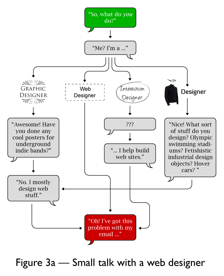 From Cameron Adams in response to this question about how to describe your job title.
My answer is buried in there, and since some script on the page causes my browser to all but crash, I'll copy it for you here.
From Cameron Adams in response to this question about how to describe your job title.
My answer is buried in there, and since some script on the page causes my browser to all but crash, I'll copy it for you here.
1) There are many kinds of designers. We forget, but there are software designers, database designers, process designers. All sorts of stuff is not graphical or visual in nature, but needs to be designed. I am not upset to be grouped in with the guys who design the flow of materials across a factory floor to become a product. At all. 2) Interaction is a bad word. There just is not a better one. Yes, experiences and interactions abound. I have given up, and just consider computer/digital=“interactive” for all these purposes. Everyone knows what you mean. 3) As a guy with an art degree, whose spent his whole career doing interactive and graphic design: design is not art. DThe solutions artists use are similar, but the intent is different. I, for one, am totally cool with you taking /any/ meaning out of my artwork. I am disappointed, and maybe not paid, if you get the wrong meaning out of a design, regardless of medium. I also could be persuaded to argue something about most art being consumable, vs. truly interactive. But I haven’t really gotten my head around that yet. 4) Why do we need titles. They have always been about folks who already know the industry. Short descriptions are just fine. "I design airplanes for Boeing." "I design radio systems for the Santa Fe railroad." "I program robots for a factory in KCK." "I design interactive systems for mobile phones." This works for 70% of those I meet at parties or on the street. Confused followup is always around the misunderstanding that software and hardware are separate design efforts, and they think I work for a phone manufacturer.So, aside from my mom, who really doesn't understand what I do now?
Friday, August 1, 2008
All scooter people can go !@#$ themselves
I am seeing this more and more, as scooters become more popular: No one knows how to drive them. This is a huge problem to me, in a car.
I know most of them can go at least 30, they aren't that underpowered, yet I routinely run across scooters that won't go over 20.
And today, just now, on the way home I had the best example of it. Smoking, driving 21 in a 30, way off to the side, and keeps waving me around. My issue: it's functionally a car, and there is a double yellow line. I have indeed gotten a ticket for passing someone on that very road. I am not gonna pass him.
Please, if you drive a scooter, pay attention. Pretend you live out in the world, and are driving a vehicle down a road, cause you are.
Subscribe to:
Posts (Atom)