Specifications are hard. There are a lot of conflicting needs, and the complexity of the documents might be more severe than the product you are specifying. Aside from designing products or interactions or interfaces, I spend a lot of time designing the documents themselves. A happy ending to this sort of process is detailed in last week's post on Designing Requirements Documentation.
Which might bring up the question: What type of specification? Design documentation, which is most of what we do (well, by hours – most actual documents by count are proposals and emails and so forth) took a long time to settle on, but it has evolved into something pretty specific and which works very well to communicate to everyone on the entire project team. There have been several evolutions, many mandated by technology alone; I used to do everything as a single sheet which functioned as sitemap and flowchart and detailed page/state layout. But when I had to work with more remote teams getting 36" x 10' pieces of paper to them was more difficult and had to change to something else.
But complete technical specifications are still something else. There are also content specifications, style guides, and lots of other documents. But today let's talk about the general technical specification, that developers use to build or modify software or presentational code to meet your design needs. Integration of technical specs with design has always been an issue. I've spent a lot of time messing with my deliverables to make them comply, or revising them to be pasted into the appendix of an IT specification. All of which is fairly unsatisfying and never helps much.
It is also important to believe that design documentation is good, important, valid work. We spend a lot of time buried in IT process, and I have to fight even people here at Little Springs to make them believe that our work and our method of work is valid. Sure, you can use IT requirements documents to do your work, but that's not their intent, and there are better ways to do it.
After a lot of work imposing myself and my team into the development process with our own documentation, way back around 2002 – while working at Sprint, I got to work my design documentation directly into the technical specification. At the time, Sprint IT used something called Application Design Documents, and I was able to persuade them that the UX team could do the best, most efficient job of making some of the document.

Note that the text and tables are in the IT format, specifying the behavior of each widget in a specific manner. And the screenshots (I prefer other methods, but this is what they could handle at the time) are placed in a process-compliant manner, but there are just about 20 times as many as usual. I also did a lot of the writing, or at least editing, of the specifications, so when it was done both the IT analyst and the whole UX team agreed on the behavior of each and every feature.
This product, both by design and implementation, was a high-water mark in ease of use in my career. Web-initiated SMS with millions of uses a day, without a help system and hardly any error messages, with impossible uptimes and no measurable customer complaints. Almost unheard of for a mobile telecom operator, at least in the US. And although it took forever to create the document, some of this was simply getting everyone involved used to the new process, and we saved a lot of time correcting errors and explaining stuff in development.
But then that dream died. After a few months of work, a big fire-everyone-for-IT-outsourcing binge left disappointingly few software designers and analysts in house. I had to start all my relationships over and reconsider how all deliverables would work with random, far-away teams using them. So for the next few years I made do by improving my design documents, communicating with project teams as much as possible, and actually writing requirement documents when I could.
Writing requirements
Which became a key task I tried to accomplish. If the UX team got engaged early enough (which is always a problem) I pushed to review and approve the requirements. Then I found out no one wants to write them, so simply volunteering gave the UX team lots of additional authority.
A key reason I like working on requirements is that they are often poorly done. For example, Business Requirements and Functional Requirements are too often conflated. A BR document is very, very high level. It contains the goals of the project, and rarely more than a couple dozen, or that's a sign you either wrote them wrong or the project is too big to be completed. Some Business Requirements you might read are:
- System shall have the ability to allow user to enter a street address and geocode it to a dynamic map displaying coverage and signal strength.
- System shall have the ability to drill down from a national map perspective if no address on file for user (i.e. in-front of log-in).
- System shall have the ability to allow user to enter only a ZIP code and geocode it to a displayed map.
- System shall have the ability to allow user to enter an intersection and geocode it to a displayed map.
- System shall have the ability to allow user to enter a City/State combination and geocode it to a displayed map.
- Etc.
But this is dead wrong. System? And so very many. That's a set of Functional Requirements, and not a well-written set at that. But all is not lost. Assuming that the marketing and product people like these, you can redo them as actual requirements. A typical, well-written Business Requirement could read:
- Allow customers to find coverage for a specific area in multiple ways: by entering a general location, a specific street address, an intersection, two locations, etc.
And this covers all those bad requirements above, and then some. Cases you don't think of at the beginning of the project are still in scope. A half dozen more like this and you have a project.
Functional requirements
A Functional Requirement on the other hand provides specifics of technical, logical, or presentational behavior. These are also boring, so often don't get enough attention. Oh, they have to be written to proceed through the IT process, but no one wants to do it, so they get poorly written. If you want to make sure the product gets built right, and that the implementation teams are doing what you designed, just insert yourself in the process.
Good Functional Requirements look like this:
FR-40 From within the Wired Web unified messaging access portal, a function will be provided for customers to move SMS messages between folders, (e.g., Inbox, Outbox, Spam).
Better written Functional Requirements help a lot. Some notes about requirement writing were in the earlier blog entry, so I won't repeat them here. But they better not all start "System shall" or "Ability to." Even if it's nerdy, academic, and technical, with otherwise annoying neutral-voice characteristics, use good english, first and foremost. The above requirement is written the way I like them all to be. First, the condition or state From within. Then, who can do it, here the customer, but the system may automatically do things at certain times or when certain conditions occur. And then, what happens. Pretty generally. An example of the folders are given, but there's not a requirement for each folder, and a comprehensive list is not given.
Not just because this would be cumbersome, but because it would be wrong. Remember, there are other documents and other requirements. The structure of the folders here is likely described in some architectural specification. So as part of this writing, be sure to understand the scope of the document, and how it works with the many other documents that are part of the IT process upon which you have imposed yourself.
The product is more important than you are
And after all that, it is a bit thankless. Your name will probably not be on the document as an author, and everyone will credit the analyst, who may not credit you. That's fine. Often, it's preferable, since UX is viewed with dark suspicion by parts of the organization.
Even as a vendor, we pretty often deliver work in someone else's template (or, have to create one that looks like the client's brand).
Getting the product right is most important; work on how your team is perceived later. Which is probably a good topic for another post in the future.
While I won't be hosting a process workshop at this year's Design for Mobile conference, there's plenty more to learn about mobile design, technology, strategy, research and implementation. Still some space available, so join us in Chicago next month.
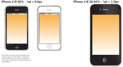 I've added an iPhone 4. Keeping to the resolution scaling didn't work for the doc size, so I had to make it different. Keep in mind. Just noticed I didn't get an annunicator row into the 4... Oh well. Sure, there are lots of places that have iOS device stencils, but if you like mine, now you have one.
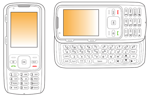 Compared to the smartphone fanbois, not everyone has this one. A featurephone. Specifically, a convertible one with 10-key one way, and a slide out keyboard. This is in outline mode only right now, but I will probably shade it someday, and will post that as well of course.
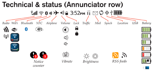 Speaking of annunciators, I am trying to not just add items, but to organize them. So, all the system status items I could think of (actually, which resulted from research for the relevant section of the book) are now ordered like a typical annunciator row, and options have been added as I encounter them.
Be sure to wander around and check out the rest. Pen input bits and pieces. More unscaled handsets for illustration. Lots of little icons and other pieces. A wholly new and fairly complete keyboard section, so you don't have to draw your own for quick comps. And more. Enjoy!
Now, off to more writing and drawing.
Speaking of annunciators, I am trying to not just add items, but to organize them. So, all the system status items I could think of (actually, which resulted from research for the relevant section of the book) are now ordered like a typical annunciator row, and options have been added as I encounter them.
Be sure to wander around and check out the rest. Pen input bits and pieces. More unscaled handsets for illustration. Lots of little icons and other pieces. A wholly new and fairly complete keyboard section, so you don't have to draw your own for quick comps. And more. Enjoy!
Now, off to more writing and drawing.


